Colors That Make Eyes Tired 😵
Certain colors can cause eye fatigue and mental strain, especially on screens:
- Bright White ⚪ → Causes glare and visual fatigue.
- Neon / Highly Saturated Colors 🌈 → Overstimulating and tiring for the brain.
- Pure Black ⚫ → Can feel heavy and increase eye strain over time.
- Bright Blue 🔵 → Intense blues from screens can cause discomfort with prolonged exposure.
Psychological Insight: Harsh or overstimulating colors force the brain to work harder, increasing mental fatigue and stress.
With or Without Illustration 🎨
With Illustration ✅
- Engages the brain visually, making screens more pleasant to look at.
- Can reduce mental fatigue if minimalist and low-contrast.
- Example: soft nature illustrations, gentle gradients.
Without Illustration 📝
- Simpler and distraction-free.
- May feel boring or monotonous, which can lead to faster mental fatigue.
- Best for users who prioritize clarity and minimalism.
Psychological Insight: Minimal, soft illustrations stimulate attention without overstimulation, balancing focus and relaxation.
Psychologically Eye-Friendly Colors 🌿
Here are some colors proven to reduce eye fatigue:
- Soft Blue / Sky Blue 🔵 (#A8DADC) – Calming, helps focus without overstimulating.
- Soft Green / Pastel Green 🌱 (#C7EFCF) – Reduces stress, associated with nature.
- Warm Neutrals / Beige / Light Taupe 🤍 (#F5F5DC) – Minimal glare, comfortable for long use.
- Lavender / Light Purple 💜 (#E6E6FA) – Gentle, mentally relaxing, good for evening use.
💡 Tip for minimalists: Use one solid background color or a subtle gradient to maintain simplicity while staying eye-friendly.
Psychological Benefits of #EEF2E6 🧘♂️
Calming and Soothing
- Soft, light greenish-beige, associated with nature, plants, and growth.
- Green tones reduce stress and promote relaxation, helping the mind feel calm.
Minimal Eye Strain 👀
- Not pure white → avoids harsh glare.
- Gentle tint helps the retina focus, reducing visual fatigue during prolonged use.
Neutral and Balanced ⚖️
- Doesn’t overstimulate the brain, unlike bright/neon colors.
- Neutral colors create stability and comfort, enhancing concentration and mental clarity.
Supports Positive Mood 😊
- Soft greens and warm neutrals are linked to peace, harmony, and safety.
- Makes users feel mentally refreshed and less anxious while looking at their device.
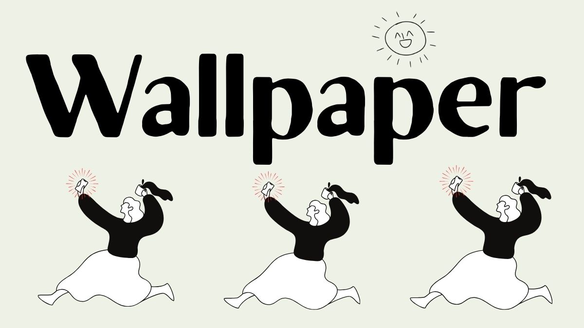
Free iPhone Wallpapers 📱
- Soft, minimalist backgrounds using #EEF2E6 and other eye-friendly colors.
- Compatible with iPhone 14 and similar models.